Personal Health Dashboard
Visualizing Personal Health Dashboard by Building an ETL Pipeline from Various Sources
In the pursuit of optimizing my physical well-being and simplifying my health journey, I’ve developed a personal health dashboard. Leveraging skills acquired during my self-learning journey in data analytics, I employed data modelling, preparation, and visualization techniques. This dynamic tool consolidates data from Google Fit, MyFitnessPal, Hevy, and Strava, offering a comprehensive view of my fitness progress.
Tools and skills: Power BI, Google Apps Script and REST API, Strava API, Postman, Git, Building ETL pipelines
Languages: Python, Javascript, and DAX
In my journey to enhance my health and fitness, I found myself toggling between multiple apps for insights (I don’t usually mind inputting the data but I would sure like I see my overall progress rather than just getting a single type of data, such as only running statistics). To simplify this process, I set out to create a personal health dashboard that merges data from various sources into one clear view. This project demonstrates my technical skills and comprehensive approach to health improvement.
During my pursuit of better health, I rely on four apps to input and track my data. These apps serve as data sources that I’ve effectively combined, forming a central hub that encapsulates my health journey:
- Google Fit: Tracks steps and movement.
- MyFitnessPal: Logs calorie intake.
- Hevy: Records strength training.
- Strava: Monitors cardio exercises.
The project also has an automated ETL pipeline. Each month, scripts run automatically to gather the latest data and update the dashboard. This saves time and ensures that the insights are always up to date.
How the sources come together — Code snippets
Utilizing Power BI for Unified Insights: To transform raw data into actionable insights, I employed Power BI, a robust data visualization and analysis tool. Power BI provides a streamlined platform to extract transform and load diverse data sets and present them coherently. Its interactive features allowed me to craft visualizations that dynamically respond to user interactions, enhancing the overall user experience.
Google Fit: For Google Fit data, I harnessed the capabilities of Google Apps Script to access the Google Fit REST API using OAuth. This script enabled me to seamlessly retrieve steps and movement tracking data. The OAuth integration ensured secure access to my data while automating the process of data collection.
The Javascript code below populates a Google sheet at prescribed timings.
Strava: When it came to running insights, I leveraged the Strava API with Python to gather comprehensive running data. By interfacing with Strava’s API (with a little help from Postman), I obtained detailed statistics on my running activities. This process allowed me to gain insights into distance, pace, elevation, and more, all essential components for a comprehensive health overview.
You can find the Jupyter Notebook below:
MyFitnessPal To shed light on my nutritional intake, I tapped into the MyFitnessPal library using Python. This allowed me to extract calorie, carbohydrate, fat, protein, and other nutritional data. The ability to script interactions with MyFitnessPal facilitated the integration of diet-related insights into the dashboard.
You can find the py file below:
Hevy — A Manual Approach for Strength Training: Although not as amenable to automation, I meticulously collected strength training data from the Hevy app. Despite the manual effort required, this dataset contributes to a holistic view of my fitness regimen. I had thought of implementing a selenium script but logging in proved to be troublesome because the website had a captcha. I could’ve used browser cookies to log in, but manually taking data does not take more than 2 minutes so I moved on without a code.
The Data Model

Table 1: Running Data — Strava
- Contains information about runs, such as distance, moving time, elapsed time, elevation gain, type, sport type, workout type, start date, location, average speed, max speed, and more.

Table 2: Meal Data — MyFitnessPal
- Records meal details, including date, meal name, calories, carbohydrates, fat, protein, sodium, and sugar content.

Table 3: Exercise Data — Hevy
- Contains exercise-related information, such as title, start date, start time, end date, end time, description, exercise title, superset ID, exercise notes, set index, set type, weight in kg, reps, distance in km, and duration in seconds.
- This table is more granular than the rest, it contains data about sets and not days. One additional table had to be creatto to group the exercises into 4 primary muscle groups

Table 4: Health Metrics Data — Google Fit
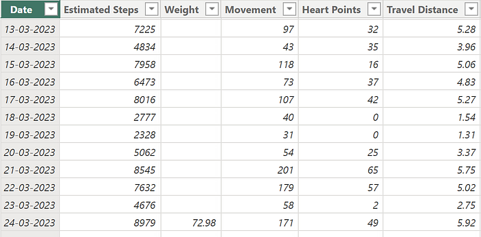
- Records health metrics like estimated steps, weight, movement, heart points, travel distance, and forecasts for specific dates.

Additional Tables:
To create a comprehensive visualization, we utilize two additional supporting tables:
Progress Table: This table houses essential data for tracking progress over time, including measurements for fat, muscle mass, and weight.
Date Table: Featuring granular date information, this table serves as a unifying element, harmonizing the data across various tables.
Together, these supporting tables contribute to a holistic and informative visualization experience
Goals and Structure of the Dashboard
As any analyst would know, a dashboard starts with asking the right questions. In our context, the first and most important question is, “What is the goal of this dashboard?” Before diving into the metrics and visuals, understanding the overarching purpose of this personal health dashboard sets the stage for a journey towards better health and fitness. Let’s explore the objectives that fuel this dynamic tool.
Overview of Dashboard Goals:
This personal health dashboard is a dynamic tool designed to help me achieve several key goals in my health and fitness journey:
1. Tracking Fitness Levels and Improvement: The dashboard provides a comprehensive view of my physical health and fitness progress.
This metric group answers the following key questions relating to improvement: Am I running faster and longer? Am I progressively overloading in my strength training? Am I evenly distributing the load between different muscle groups?
2. Tracking Consistency in Workouts and meals: Consistency is the cornerstone of any successful fitness journey. This dashboard helps me track my adherence to workout routines, ensuring I stay on course to reach my goals.
This metric group can answer the following key questions: How much protein am I eating? how many cheat days did I have? What is my average calorie intake? Do I take the prescribed 8000 steps per day? Do I sit a lot? Do I work or run at least 3 times a week?
3. Tracking Progress Towards My Goals: Whether it’s weight loss, muscle gain, improved cardiovascular fitness, or dietary goals, this dashboard keeps me informed about how I’m progressing toward my health objectives.
This metric group can answer the following questions: How much muscle mass did I gain? What are the changes in my weight?
The Dashboard
Now that we’ve outlined the goals of my dashboard, let’s explore its structure. I had to spend a lot of time brainstorming the metrics and the KPIs that seemed relevant to achieve the goals as outlined above.
To achieve its purpose, the dashboard had to be divided into 4 key sections
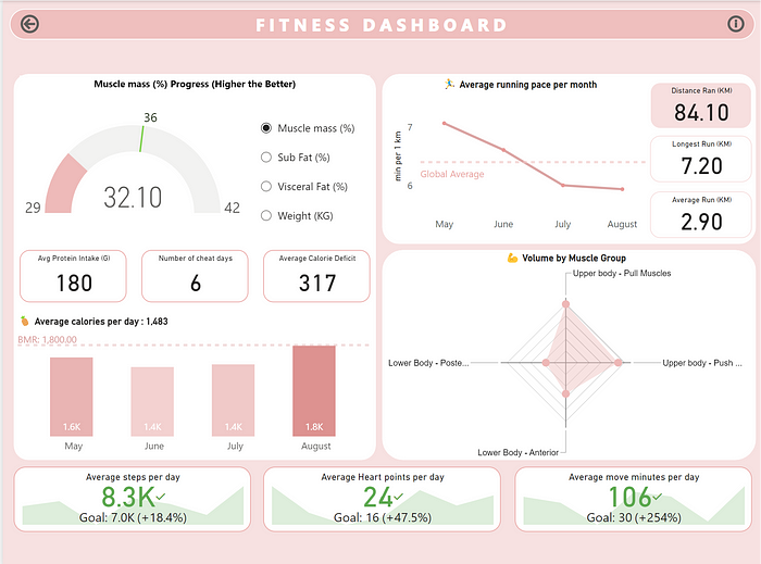
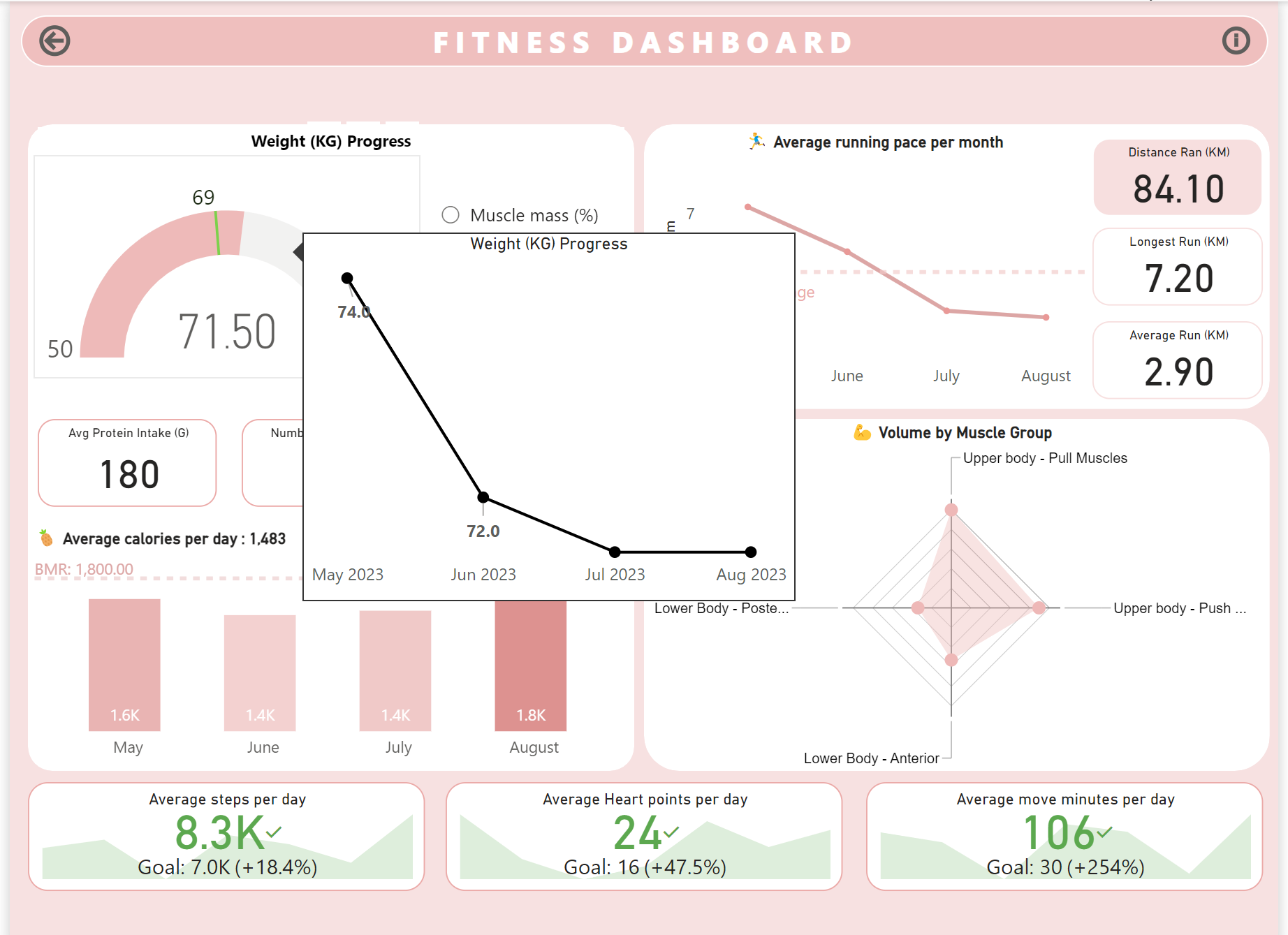
- Calories and Progress: This section provides an overview of your calorie consumption and progress towards your fitness goals. This is largely based on the myfitnesspal data and has KPIs such as the number of cheat days, Caloric Surplus/Deficit, and most importantly average protein intake (any gym bro would agree). Similarly, there is a small subsection here that tracks progress towards your ultimate goals with a gauge (Muscle mass, Weight etc.); The latter section also has a tooltip that tracks your progress over time.
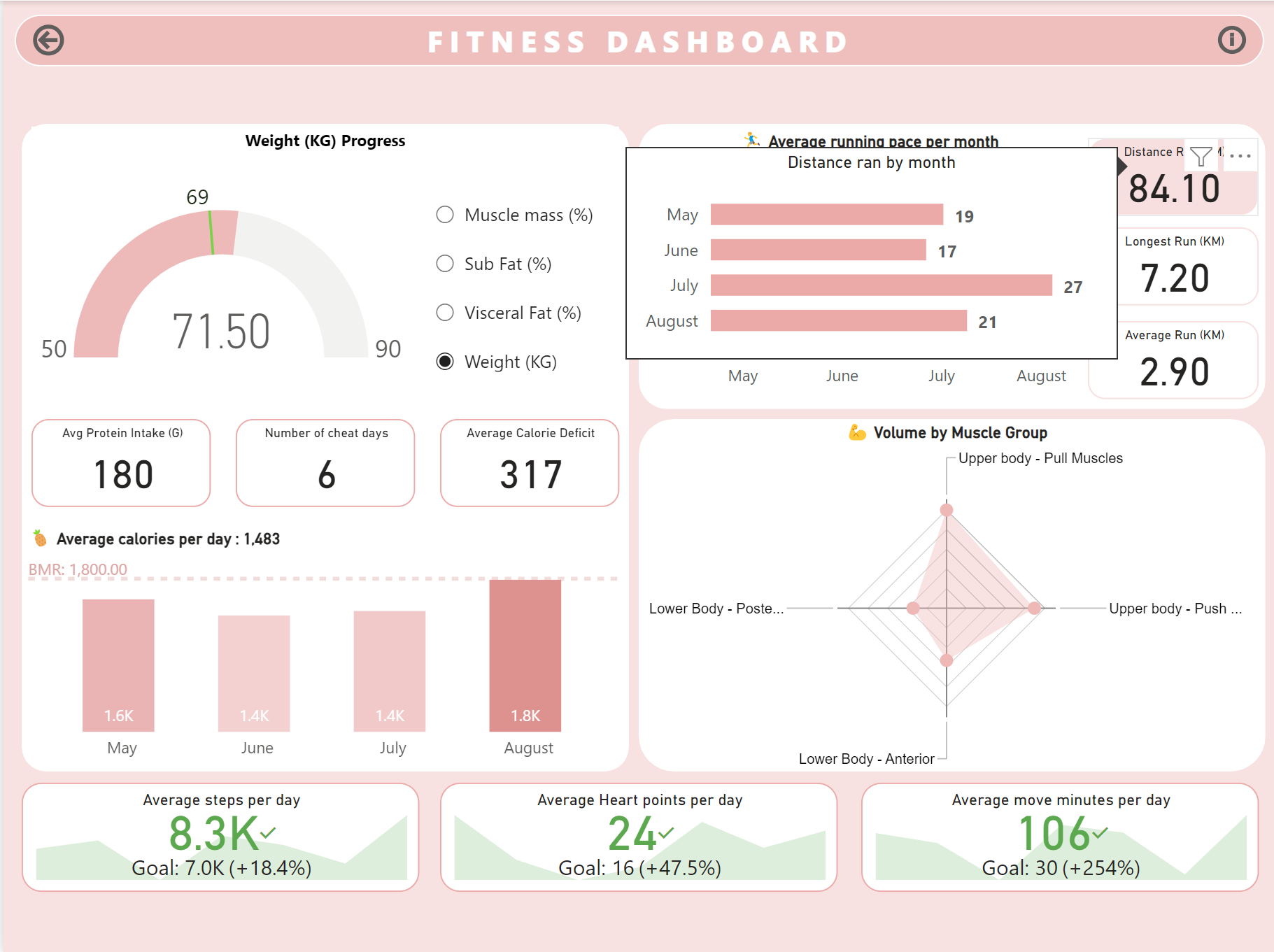
- Running Data: Here, you can explore detailed data related to your running activities, including distance, pace, and duration. In this section, you can observe how your pace has improved, and it can also track your endurance level.
- Strength Data: This section offers insights into your strength training regimen, showcasing metrics like weight lifted, reps, and sets. This section draws insight from the heavy data sets. It has a radar chart that shows the distribution for muscle groups; furthermore, when you hover over the muscle groups, you can find a breakdown of volume and consistency by month.
- Movement Data: In this area, you can delve into various aspects of your movement patterns and activities. The key metrics here are Heart points, steps, and move minutes.
Enough of just talking about the dashboard — Take a look below to see the image gallery:

As said earlier to enrich the dashboard further, I have also added some tooltips that can give additional information about the metric you hover over.


Thank you so much for reading my article
Do reach out if you want to collaborate with me or learn more about me! I hope reading this was helpful in some way :)
PS: If anyone knows how to take colour-accurate screenshots in Windows please let me know! The colour of my dashboard changed in the screenshots :(
References:
For the Strava API, I referred to this YouTube video → Link
Google Fit integration→ Link
MyFitnessPal Library → Link
